CHOOSE PROJECT
Top challenges we overcame
We ran audience research across CEOs, marketers, and physicians to build a clear, evidence-led foundation.
CHALLENGE ONE
Understanding a complex, multi-audience market
CHALLENGE TWO
Uncovering the emotional drivers behind medical decision-making
We learned that “control” and “clarity” were the themes shaping how people choose marketing partners, and built this insight into every later decision.
We used direct stakeholder conversations to validate what mattered, making sure the strategy reflected real-world expectations rather than internal guesses.
CHALLENGE THREE
Cutting through assumptions and getting to real needs
Background
When they approached us, they had a powerful idea but no name, no brand and no structure for how that idea would translate into a the-leading medical marketing agency in Bristol.
We worked with them from the ground up to shape every part of the business: from research and USPs to brand, website, and launch.
Research planning
Research was the anchor for everything that followed.
We began by mapping the audiences AGENCY needed to reach: CEOs, marketing managers, procurement teams, and physicians, and then ran targeted conversations to understand their frustrations, goals, and buying behaviours.
What stood out was a shared need for control: the ability to make informed decisions and maintain ownership of their narrative. This became the strategic thread we carried through naming, brand, offer, tone of voice and website.
The research also revealed gaps in competitor positioning. Most agencies either leaned heavily on jargon or overcomplicated their promise. That insight helped us carve a smarter, more grounded space for AGENCY; one that felt contemporary, credible and human.

Top challenges we overcame
We interviewed former collaborators to surface what genuinely set him apart.
CHALLENGE ONE
Translating the founder’s skill set into a clear market position
CHALLENGE TWO
Distilling broad strengths into a tight, usable USP set
We refined wide-ranging expertise into three core value pillars the market would immediately understand.
We cross-checked everything against the research so the offer was built around what audiences actually valued.
CHALLENGE THREE
Ensuring the USPs aligned with real customer priorities
Explainer
Defining AGENCY’s USPs meant starting with the founder.
We spoke to people who had worked with him before and asked why they trusted him. Three themes kept repeating:
his legal and medical background, his extensive sales experience, and the simple fact that he was easy to work with.
We therefore shaped these into three value pillars:
-
Compliance
-
Growth
-
Partnership
These USPs tied directly into the needs identified during research, especially the desire for clarity and reliability. They became the foundation for the service offering and a framework we used to judge every strategic and creative choice that followed. It meant the brand was built around strengths that weren’t generic; they were lived and recognised by real clients.

-
Top challenges we overcame
We discovered “AGENCY” from the shared desire for control across patients and professionals.
CHALLENGE ONE
Finding a name with real strategic weight
CHALLENGE TWO
Balancing a sleek, modern style with the trust required in healthcare
We built a black-and-white led system with bright accents to signal confidence without feeling cold.
We produced detailed rules for colour, type, logo usage, and tone to keep everything consistent post-launch.
CHALLENGE THREE
Creating guidelines robust enough for a full multi-channel launch
Explainer
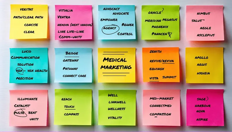
Naming the business was the moment everything clicked.
Our research showed that medical professionals, patients, and marketers all wanted the same thing: agency over their decisions. The name captured both the business model and the emotional value it delivered.
We then built the visual identity around a clean, monochrome aesthetic lifted with flashes of colour. It felt contemporary and confident, but still suitable for clinical environments.
We expanded the palette to six secondary colours so the brand could flex across animations, web, print and content without losing coherence.
To support long-term consistency, we created a full brand guidelines document, covering everything from spacing rules to imagery style. It gave the team a toolkit they could rely on as the business grew.

Top challenges we overcame
We structured the project around sprints and clear checkpoints to keep momentum without sacrificing quality.
CHALLENGE ONE
Launching a full website in a matter of weeks
CHALLENGE TWO
Translating tone, visuals, and USPs into a practical user journey
We mapped a clear sitemap and wireframes to make sure the ideas translated cleanly into UX.
We set up a tight feedback loop so the client could shape decisions without delaying progress.
CHALLENGE THREE
Keeping everything collaborative without slowing the build
Explainer
The website had to communicate the brand with clarity and give AGENCY credibility from day one.
We started with a sitemap shaped around the three core products: Patient Marketing, ABM for tenders, and Physician Marketing, then sketched wireframes using lorem ipsum to lock the structure before writing began.
Once approved, we wrote the full site in the new tone of voice. Friendly, persuasive, and stripped of medical jargon. The design phase followed quickly, leaning into the modern black-and-white aesthetic with bold typographic moments and clean structure.
Because we’d done the groundwork early, the build moved quickly. The whole site went from blank page to fully launched in two weeks, ready for the brand’s public debut.

Top challenges we overcame
We chose a typographic style that matched the brand and allowed fast production.
CHALLENGE ONE
Delivering multiple animations at speed
CHALLENGE TWO
Communicating benefits without relying on live-action footage
We used strong copy, motion, and colour to create impact without shooting video.
We kept everything rooted in the visual and verbal guidelines.
CHALLENGE THREE
Ensuring animations enhanced the brand rather than feeling separate
Explainer
To support the launch, AGENCY needed animation that could sit across the website, social media, and presentations.
We created a main brand launch animation for the homepage header, plus three smaller benefit-led animations showcasing what makes the brand different.
We avoided live action to keep production fast and cost-effective. Instead, we leaned into motion typography, brand colours, and simple visual metaphors to express ideas quickly and clearly.
The result was a set of polished, contemporary animations that instantly elevated the brand and helped visitors understand the offer at a glance.

Top challenges we overcame
We created structured episode outlines that could be broken into social posts, email content, and blogs.
CHALLENGE ONE
Building a podcast that was both useful and easily repurposed
CHALLENGE TWO
Ensuring every episode addressed a real audience pain point
We based topics and sections on our research so nothing felt generic or filler.
We joined sessions to keep delivery sharp, on-brand, and aligned with the strategy.
CHALLENGE THREE
Supporting the recording process itself
Explainer
The podcast added depth to the launch by positioning AGENCY as an industry voice from the outset.
We developed the concept, then built episode templates with defined sections that could be sliced into multiple content formats. Every episode had a clear purpose, helping medical marketers tackle specific challenges with clarity.
We also supported the recording, helping the team stay focused, natural, and aligned with the brand’s tone.
The outcome was a podcast that doubled as a marketing engine, feeding social posts, emails, and blogs while building credibility across the sector.

Top challenges we overcame
We built a six-month SEO roadmap focused tightly on high-intent local keywords.
CHALLENGE ONE
Getting a brand-new website to rank quickly in a competitive niche
CHALLENGE TWO
Strengthening on-page SEO without diluting the tone of voice
We integrated keywords while keeping the copy clean, human, and readable.
We optimised Google My Business and built supporting content to capture local search behaviour.
CHALLENGE THREE
Improving local visibility beyond the website
Explainer
Once the website launched, we shifted focus to visibility.
We researched local medical marketing keywords and shaped a roadmap designed to get AGENCY ranking quickly. This included updating on-page copy, producing targeted blog posts, and optimising Google My Business to support local search.
Within a month, AGENCY ranked top for its priority keywords and became the leading local profile for medical marketing in Bristol. That early visibility drove traffic, enquiries, and credibility, cementing the brand as the city’s go-to specialist.
Client's perspective.
"Client quote goes here".

Client's name
Client's job role
5/5:


